
Web Design Case Study
Role: Web Designer
Tools: Figma, Canva
Project Type: Personal/Client Concept
Date: January 2026
Project Overview
GenderNerds.co.uk is a website designed as a curated archive of essays, blog posts, zines, and creative writing by comedians, artists, and writers exploring gender.
The design challenge was to create a site that deliberately references early 1990s internet aesthetics while remaining readable, navigable, and responsive for modern users.
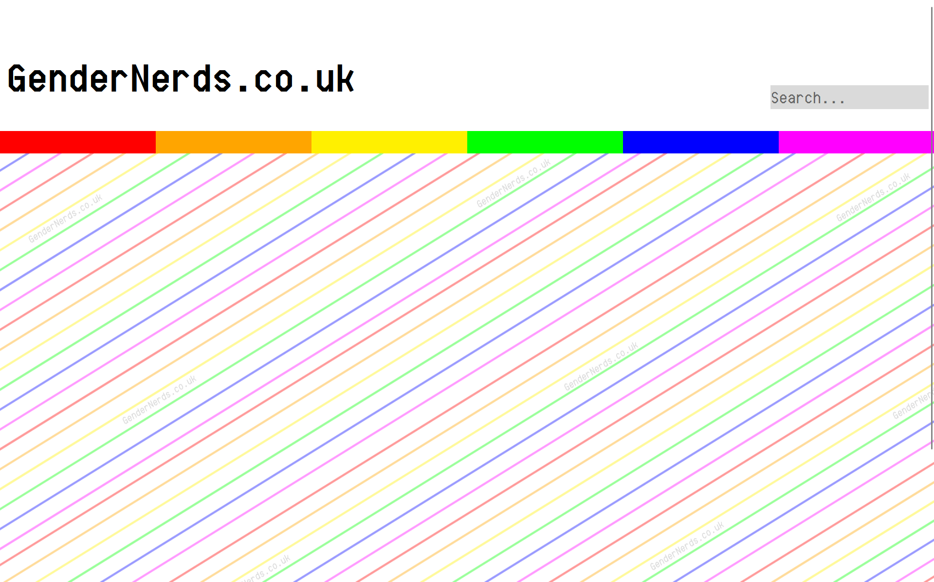
Homepage Design
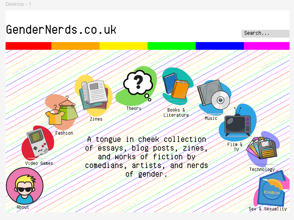
The homepage introduces the site’s tone immediately through bold colour blocking, icon-led navigation, and a playful typographic treatment.
Key goals of the homepage design included:
- Establishing a nostalgic web aesthetic inspired by early internet culture
- Clearly communicating the site’s purpose at first glance
- Providing intuitive navigation through visual categories rather than dense menus
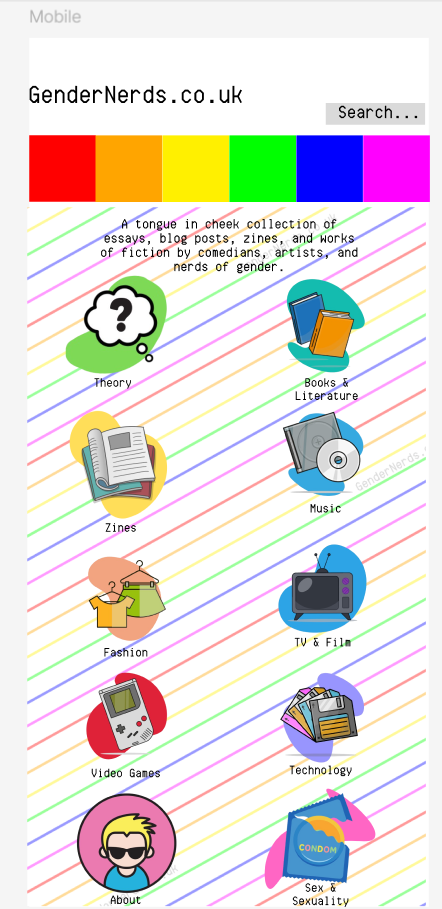
Desktop and mobile layouts were designed separately to ensure the structure translated effectively across screen sizes.
Navigation & Information Archive
Content on GenderNerds.co.uk is organized by category, allowing users to browse topics such as theory, books and literature, zines, music, technology, and popular culture.
Navigation is driven by:
- Category icons that act as primary entry points
- A consistent color system reinforcing each section
- Grid-based layouts on desktop and vertical stacking on mobile
This structure prioritizes exploration while keeping the interface visually playful.
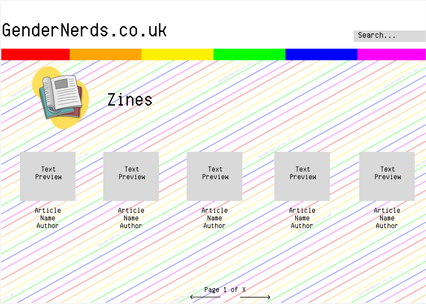
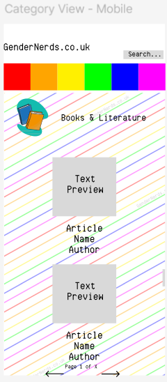
Content & Reading Experience
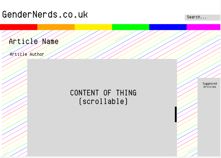
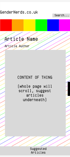
Article pages were designed with readability in mind.
On desktop:
- The background and header remain fixed
- Content scrolls within a defined central area
On mobile:
- Articles scroll naturally as full-page content
- Suggested articles are presented beneath the main text
This approach ensures that the visual identity does not interfere with long-form reading.
Responsive Design
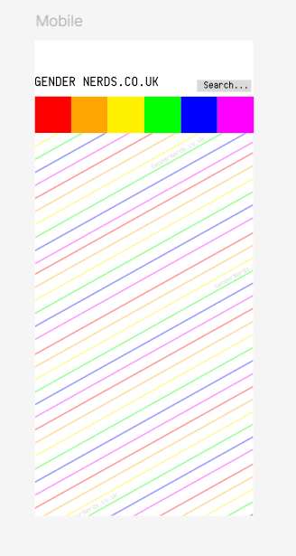
Responsiveness was a core consideration throughout the project. Rather than simply resizing elements, layouts were restructured to suit different devices:
- Desktop prioritises horizontal space and visual composition
- Mobile prioritises vertical flow and ease of interaction
Each screen was designed intentionally, rather than adapted automatically.
Visual Design System & Assets
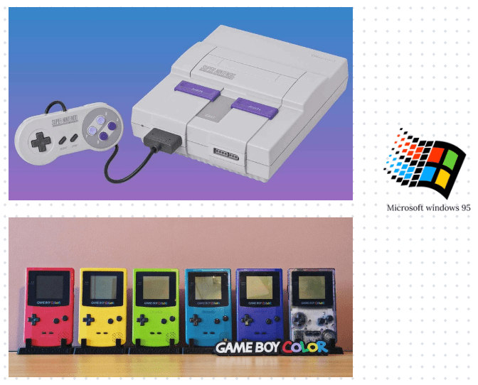
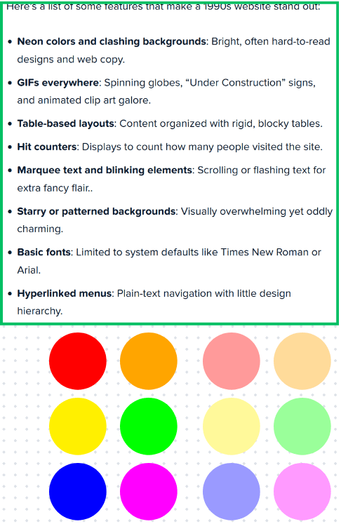
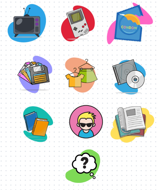
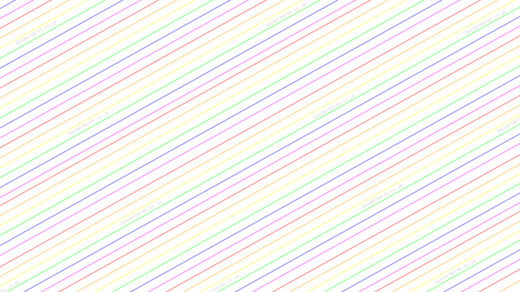
The visual system draws heavily on early web design tropes, including:
- Bright, high-contrast color palettes
- Patterned backgrounds
- Bold iconography
Mood boards were created to guide the aesthetic direction, while icons and backgrounds were custom-edited to ensure consistency across the site.
Reflection
This project allowed me to explore how nostalgic design aesthetics can be reinterpreted for contemporary web experiences.
Key takeaways from the project include:
- Balancing playful visuals with usability
- Designing responsive layouts from first principles
- Translating conceptual themes into functional interface design
GenderNerds.co.uk is a completed design concept prepared for future development.
Skills Demonstrated
- Visual research and mood boarding
- Information architecture
- Responsive web design
- Iconography and UI design
- Concept-led design thinking
 Michaela Sallese